
Previously, you learned how to manipulate a large amount of data. You learned how to import a text file, how to delete one or more columns and rows, as well as how to get data according to a certain condition. Now it's time to learn how to analyze your results. In this section, you will learn how to graph your results, especially over time.
Previously, you learned how to manipulate a large amount of data. You learned how to import a text file, how to delete one or more columns and rows, as well as how to get data according to a certain condition. Now it's time to learn how to analyze your results. In this section, you will learn how to graph your results, especially over time.
Before we start, I will just write the needed Python code for this tutorialfrom the previous one (please go to Python: Pandas DataFrame data manipulation).
#Importing library
import pandas as pd
#Getting data from the text file
df = pd.read_csv('vaccinations.txt', header = None, skiprows = (1), sep = ',', quotechar = None, quoting = 3)
#Setting a header for the DataFrame
df.columns = ['Country','Country iso code','Date','Total vaccinations','People vaccinated','People fully vaccinated','Total boosters','Daily vaccinations raw','Daily vaccinations','Total vaccinations per hundred','People vaccinated per hundred','People fully vaccinated per hundred','Total boosters per hundred','Daily vaccinations per million','Daily people vaccinated','Daily people vaccinated per hundred']
#Printing the DataFrame
print(df)
#Getting data per country
country = input('Please type your country of interest:')
df_country = df[df['Country'] == country]
#Printing the column Date of the the DataFrame df_country
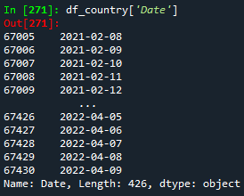
print(df_country['Date'])
If we run this code, we will notice that the Date column is of type object, as seen below:
Now, we will learn how to plot date data. For this purpose, we will convert the Date column from an object type to a datetime type. The datetime format will help get a better plot.
#Converting date to datetime format
df_country['Date'] = pd.to_datetime(df_country['Date'])
df_country.sort_values('Date', inplace=True)
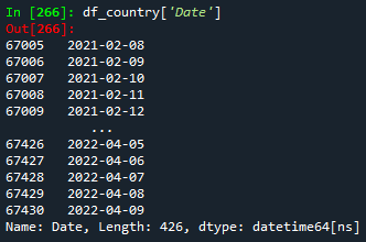
#Printing the column Date of the DataFrame df_country
print(df_country['Date'])
Python has a library named matplotlib.pyplot which is used for plotting purposes. Once this library is imported, we can choose the plot style.
#Importing library
import matplotlib.pyplot as plt


#Choosing the plot style
plt.style.use('seaborn')
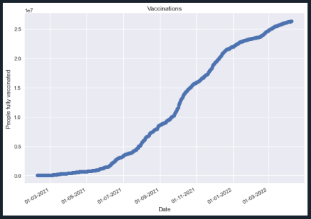
Now, we must set the x- and y-axis values. We will plot the number of people fully vaccinated over time for the user-specified country.
#Setting the axis values
x = df_country['Date']
y = df_country['People fully vaccinated']
Once the axis values are defined, we can start plotting. For this, we will give the date format to the x-axis. In order to do so, the library dates from the matplotlib library is needed. We will also set names to both x- and y-axis, as well as, to the graph.
#Importing library
from matplotlib import dates as mpl_dates


#Making the graph
plt.plot_date(x,y)


#Giving date format to the x-axis
plt.gcf().autofmt_xdate()
date_format = mpl_dates.DateFormatter('%d-%m-%Y')
plt.gca().xaxis.set_major_formatter(date_format)
plt.tight_layout()


#Naming both axis and the graph
plt.xlabel('Date')
plt.ylabel('People fully vaccinated')
plt.title('Vaccinations')
plt.show()
Then, the final Python code will look like this:
#Importing library
import pandas as pd
import matplotlib.pyplot as plt
from matplotlib import dates as mpl_dates


#Getting data from the text file
df = pd.read_csv('vaccinations.txt', header = None, skiprows = (1), sep = ',', quotechar = None, quoting = 3)


#Setting a header for the DataFrame
df.columns = ['Country','Country iso code','Date','Total vaccinations','People vaccinated','People fully vaccinated','Total boosters','Daily vaccinations raw','Daily vaccinations','Total vaccinations per hundred','People vaccinated per hundred','People fully vaccinated per hundred','Total boosters per hundred','Daily vaccinations per million','Daily people vaccinated','Daily people vaccinated per hundred']


#Printing the DataFrame
print(df)


#Getting data per country
country = input('Please type your country of interest:')
df_country = df[df['Country'] == country]


#Printing the column Date of the the DataFrame df_country
print(df_country['Date'])


#Plotting


#Converting date to datetime format
df_country['Date'] = pd.to_datetime(df_country['Date'])
df_country.sort_values('Date', inplace=True)


#Printing the column Date of the DataFrame df_country
print(df_country['Date'])


#Choosing the plot style
plt.style.use('seaborn')


#Setting the axis values
x = df_country['Date']
y = df_country['People fully vaccinated']


#Making the graph
plt.plot_date(x,y)


#Giving date format to the x-axis
plt.gcf().autofmt_xdate()
date_format = mpl_dates.DateFormatter('%d-%m-%Y')
plt.gca().xaxis.set_major_formatter(date_format)
plt.tight_layout()


#Naming both axis and the graph
plt.xlabel('Date')
plt.ylabel('People fully vaccinated')
plt.title('Vaccinations')
plt.show()
Congratulations! Now, you are also able to plot data containing date format! You are getting a Python expert. Keep learning! To download the complete code and the text file containing the data used in this tutorial, please click here.
Views: 1
Related Articles


Notifications
Receive the new articles in your email
Other Articles

Unburnable carbon
joushe info

How to be a millionaire with stocks during a financial crisis
stats con chris

12 interesting facts about living in Russia
joushe info

Steps to start investing in the US Stock Market
stats con chris

Why do altcoins follow bitcoin trend against the dollar
stats con chris