
We learn to program in Python using Anaconda. As an example we consider importing text files and processing data to obtain 2-dimensional graphs.
We learn to program in Python using Anaconda. As an example we consider importing text files and processing data to obtain 2-dimensional graphs.
How can we learn a programming language? The most efficient method is to consider reverse engineering, that is, instead of starting from zero, we start from a code that has already been developed, and the purpose is to understand it and then modify it. In this article we will use this method to get a glimpse of the Python programming language. As a starting point we will focus on importing and processing data, that is, we will obtain graphs from data stored in text files. I consider this as the basis to understand a programming language because you can easily apply it to your daily tasks. For example, if you are a student, at some point you will need to plot some graphs. Most of your colleagues will use Excel, but you, once finishing reading this article, will opt for Python, because you will realize that the more you use a programming language, the more capable you will be to create amazing things.
Before starting this exercise, you must have Jupyter Notebook installed on your computer. The most practical way to install it is considering Anaconda. Once you have it, the next step is to download the files from my repository @Github. More details are given in the following video:
(video not yet available)
The repository contains the Python code import-plot.ipynb that you can open and run using, for example, Jupyter Notebook. It also contains a folder with 37 text files that correspond to the data that we will use to make our first graphs. For example, the first text file is given as follows:
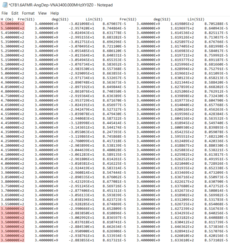
All text files have the same format. The first row contains the names: H (Oe), Fre (S21), deg (S21), Lin (S21), Fre (S12), deg (S12), Lin (S12), and the subsequent rows contain the numerical values . As you can see in Fig. 1, the first column has repeated data, these are highlighted in red. The first step is to import the 37 text files in Python but omitting the repeated data, that is, when importing each file we will only consider the data that goes from line 2 to line 42. Of course, you must bear in mind that in Python you start counting from zero, i.e.,
Moreover, when reading the lines, we have to do it until line 43 because Python does not consider the closing line. You will easily understand this by accessing the code, which contains a detailed explanation of the technical part. You should note that up to now it is not important to know what the data is about because we are simply importing them. The second step would be to create the transpose of the imported data, i.e.,
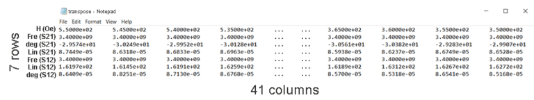
In Fig. 2 we have the transpose of the imported data, that is, those that were columns (rows) in Fig. 1 now become rows (columns). But that’s not all, the third step would be to reverse the order of the columns, in that way we will obtain an arrangement similar to the following one:
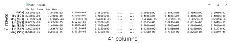
As you can see in Fig. 3, our data is ordered in such a way that the first row starts with 3.50e + 02 and ends with 5.50e + 02. Now let’s proceed with the graphs. For example, if we want to plot Fre (S21) vs H (Oe), then from Fig. 3 we would have to choose the first two rows and store them in pairs (x, y), in this way we would have:
This graph would give us a horizontal line because Fre (S21) is constant for all the values of H. Before proceeding with the next step, I will explain what these data are about, however, keep in mind that it is not so important and I will only do it to clear your curiosity. These data belong to a measurement experiment. The results were published in the following paper: arxiv.org/pdf/2001.05135.pdf. There, the authors measured an AC current signal in a material that was subjected to a magnetic field. These measurements were made in two configurations denoted S12 and S21. An AC current signal is expressed mathematically as:
Bearing this in mind, Fig. 1 now makes sense, the values of the amplitude (Lin), the frequency (Fre) and the phase (deg) of the AC current have been collected for different values of the magnetic field H and for the given configurations (S12 and S21). All this data appears in each of the files, but why we have 37 files? This is because besides studying how the magnitude of the magnetic field influences the AC current signal, the authors also studied the influence of its angular position, that is, the H field was applied with different angles, to be exact, in 0, 5, 10, …, 175 and 180 degrees, giving a total of 37 angular positions, or what it is, 37 text files. Resolved this curiosity, now let’s proceed with the fourth step, which is to plot the following pairs:
$$(x, y) = ( \text{H}, \frac{ \text{Lin} - \text{Lin}( \text{H}=355) }{ \text{Lin}( \text{H}=355)}).$$On the x axis we consider the magnetic field H and on the y axis we consider the relative amplitude (r) of the signal, which is given with respect to a fixed value. In this case the fixed value will be the amplitude when H = 355. Remember that there are two configurations, S12 and S21, therefore, we will have two types of graphs. Additionally, for each of these graphs we will have to gather the data from the 37 text files because we want all the angular positions to be present. It looks a bit cumbersome and that is why in Python we will use loops to achieve this goal. I invite you to explore the code to better understand what I am talking about.
Finally, to conclude this experience, the last step will be to plot a two-dimensional graph. If r is the relative amplitude of the signal, then r depends on two variables, the angular position and the magnitude of the H field. This implies that r can be visualized in a 2D plane:
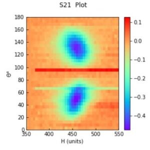
In Fig. 4 we have plotted r for the S21 configuration, in the x axis we have the magnitude of the magnetic field H and in the y axis the angular position; For each pair (x, y), there is a definite value of r. As you can see, 2D graphs offer a much more interesting result…
I invite you to run the code to capture the essence of this article, and with this... welcome to Python.
Views: 1 Github
Related Articles


Notifications
Receive the new articles in your email
Other Articles

Probability theory in the FIFA World Cup Qualifiers
stats con chris

The origin of bitcoins. A complete explanation for beginners
stats con chris


The past and the future of bitcoins. A mathematical history
stats con chris